Once you've started dabbling in HTML, you'll probably be interested in adding more power to your web pages. CSS is the best way to do that. CSS lets you apply changes across your entire page without relying on inline styling.
Here are several simple CSS examples to show you how to make some basic styling changes on your web page.
1. Basic CSS Code for Easy Paragraph Formatting
Styling with CSS means you don't have to specify a style every time you create an element. You can just say "all paragraphs should have this particular styling" and you're good to go.
Let's say you want every paragraph (<p>, one of the HTML tags everyone should know) to be slightly larger than usual. And dark grey text, instead of black. The CSS code for this is:
p {
  font-size: 120%;
  color: dimgray;
}
Simple! Now, whenever the browser renders a paragraph, the text will inherit the size (120 percent of normal) and color ("dimgray").
If you're curious as to which plain-text colors you can use, check out this CSS color list from Mozilla.
2. Change Letter Case
Want to create a designation for paragraphs that should be in small caps? A CSS sample for that would be:
p.smallcaps {
  font-variant: small-caps;
}
To make a paragraph that's entirely in small caps, we'll use a slightly different HTML tag. Here's what it looks like:
<p class="smallcaps">Your paragraph here.</p>Adding a dot and a class name to an element specifies a sub-type of that element defined by a class. You can do this with text, images, links, and just about anything else.
If you want to change the case of a set of text to a specific case, use these CSS examples:
text-transform: uppercase;
text-transform: lowercase;
text-transform: capitalize;
The last one capitalizes the first letter of every sentence.
3. Change Link Colors
Style changes aren't limited to paragraphs. There are four different colors a link can be assigned: its standard color, its visited color, its hover color, and its active color (which it displays while you're clicking on it). Here's the CSS code for those:
<!DOCTYPE html>
<html>
<head>
<style>
a:link {
color: blue;
}
a:visited {
color: green;
}
a:hover {
color: red;
}
a:active {
color: Yellow;
}
</style>
</head>
<body>
<a href="https://www.thetechplatform.com">The Tech Platform</a>
</body>
</html>
In this example, the link color changes to red when the user hovers over it with their mouse. You can replace red with any valid CSS color value to change the hover color to your desired color.
4. Remove Link Underlines
While underlined text clearly indicates a link, it sometimes looks nicer to scrap that underline.
You can also use this CSS property to remove underlining from other elements like headings or paragraphs
<!DOCTYPE html>
<html>
<head>
<style>
.no-underline-link {
  text-decoration: none;
}
</style>
</head>
<body>
<a href="https://www.thetechplatform.com" class="no-underline-link">The Tech Platform</a>
</body>
</html>
n this example, we use CSS to target the anchor element with the no-underline-link class, and set the text-decoration property to none. This removes the default underline styling from the link.
5. Make a Link Button
When the user clicks the button, they will be taken to the URL specified in the href attribute of the anchor element.
<!DOCTYPE html>
<html>
<title>Online CSS Editor</title>
<head>
<style>
.button-link {
  display: inline-block;
  padding: 10px 20px;
  background-color: #4CAF50;
  color: white;
  text-decoration: none;
  border-radius: 5px;
}

.button-link:hover {
  background-color: #3e8e41;
}
</style>
</head>
<body>
<a href="www.thetechplatform.com" class="button-link">Click me</a>
</body>
</html>Output:

In this example, we use CSS to style the anchor element with the button-link class. The display property sets the element to inline-block so that we can apply padding and other styles to it, and the padding property adds some padding around the text content of the button.
The background-color and color properties set the background color and text color of the button, respectively, and the text-decoration property removes any underlining from the link. The border-radius property adds rounded corners to the button.
The :hover pseudo-class targets the button when the user hovers over it with their mouse and changes the background color to a darker shade.
6. Create a Text Box
A plain paragraph isn't very exciting. If you want to highlight an element on your page, you might want to add a border. Here's how to do that with a string of CSS code:
p.important {
border-style: solid;
border-width: 5px;
border-color: purple;
}
This one is straightforward. It creates a solid purple border, five pixels wide, around any important-class paragraph. To make a paragraph inherit these properties, just declare it like this:
<p class="important">Your important paragraph here.</p>This will work regardless however big the paragraph is.
There are many different border styles you can apply; instead of "solid," try "dotted" or "double." Meanwhile, the width can be "thin," "medium," or "thick." CSS code can even define the thickness of each border individually, like this:
border-width: 5px 8px 3px 9px;That results in a top border of five pixels, a right border of eight, a bottom of three, and a left border size of nine pixels.
7. Center-Align Elements
For a very common task, centering elements with CSS code is surprisingly unintuitive. Once you've done it a few times though, it becomes much easier. You have a couple of different ways to center things.
For a block element (usually an image), use the margin attribute:
.center {
display: block;
margin: auto;
}
This ensures that the element is displayed as a block and that the margin on each side is set automatically. If you want to center all the images on a given page, you can even add "margin: auto" to the img tag:
img {
margin: auto;
}
But what if we want to center text with CSS? Use this sample CSS:
.centertext {
text-align: center;
}
Want to use the "centertext" class to center the text in a paragraph? Simply add that class to the <p> tag:
<p class="centertext">This text will be centered.</p>8. Adjust Padding
The padding of an element specifies how much space should be on each side. For example, if you add 25 pixels of padding to the bottom of an image, the following text will be pushed 25 pixels down. Many elements can have padding, not just images.
Let's say you want every image to have 20 pixels of padding on the left and right sides, and 40 pixels on the top and bottom. The most basic execution is:
<!DOCTYPE html>
<html>
<title>Online CSS Editor</title>
<head>
<style>
.image-container {
  padding-top: 30px;
  padding-right:30px;
  padding-bottom: 30px;
  padding-left: 30px;
}
img
{
    border:1px solid black;
}
</style>
</head>
<body>
<div class="image-container">
  <img src="https://static.wixstatic.com/media/0f65e1_869334a65e9f4c548f9ba32c3cf69383~mv2.png">
</div>
</body>
</html>Output:

In this example, we use the .image-container class to apply a padding of 30 pixels around the image. The padding property sets the padding for all four sides of the container element (top, right, bottom, and left) to the same value.
This will create a 30 pixel gap between the edge of the image and the edge of the container element. You can adjust the padding value as needed to achieve the desired spacing. If you only want to apply padding to a specific side of the element (e.g. only to the top), you can use the padding-top, padding-right, padding-bottom, and padding-left properties to set different padding values for each side of the container element individually.
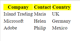
9. Highlight Table Rows
CSS code makes tables look much nicer than the default grids. Adding colors, adjusting borders, and making your table responsive to mobile screens are all easy. We'll look at just one cool effect here: highlighting table rows when you mouse over them.
Here's the code you'll need for that:
<!DOCTYPE html>
<html>
<title>Online CSS Editor</title>
<head>
<style>
.header-row {
  background-color: yellow;
}
</style>
</head>
<body>
<table>
  <tr class="header-row">
    <th>Company</th>
    <th>Contact</th>
    <th>Country</th>
  </tr>
  <tr>
    <td>Island Trading</td>
    <td>Maria</td>
    <td>UK</td>
  </tr>
  <tr>
    <td>Microsoft</td>
    <td>Helen</td>
    <td>Germany</td>
  </tr>
  <tr>
    <td>Adobe</td>
    <td>Philip</td>
    <td>Mexico</td>
  </tr>
</table>
</body>
</html>Output:

In this example, we use the .header-row class to apply a background color to the top row of the table. The background-color property sets the color of the background for the table row. This will make the top row appear highlighted with a yellow background color.
10. Move images from Transparent and Opaque
CSS code can help you do cool things with images, too. Here's a CSS example to display images at less than full opacity, so they appear slightly "whited out". When you mouse over the images, they're brought to full opacity
Here's an example of how to move an image from transparent to opaque using CSS animation:
HTML code:
<img src="transparent-image.png" id="moving-image">CSS code:
#moving-image {
  opacity: 0; /* start with the image being transparent */animation: opacity-transition 2s linear forwards;
}

@keyframes opacity-transition {
  from { opacity: 0; } /* start at 0% opacity */to { opacity: 1; } /* end at 100% opacity */
}
In this example, we first set the opacity of the image to 0 so that it is transparent. We then define a CSS animation using the @keyframes rule, which animates the opacity property from 0 to 1 over a duration of 2 seconds. We apply the animation to the image using the animation property, which sets the animation to use the opacity-transition keyframes and specifies that the animation should run forwards to the end state (i.e. the image should end up completely opaque).
When the page loads, the image will start off transparent, and then gradually transition to being completely opaque over a period of 2 seconds. You can adjust the duration of the animation and the starting/ending opacity values to achieve different effects.
The Tech Platform


Comentários