Overview
In this article, we will talk about how we can create a Gantt Chart using R script visual within the Power BI.
In Power BI, there are many custom visuals which provide flexibility to create a Gantt Chart. But my requirement was somewhat different. I have the following scenario and the following types of data.
Scenario
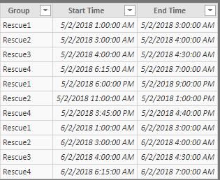
Please refer to the below screenshot.
I have information for different groups with their start time and end time. I want to represent a filled area with the line (duration) for every group.
Example
If Group 1 has a duration from 1:00 AM to 3:00 AM, I want to show the highlighted area between 1:00 PM to 3:00 PM. To represent this type of duration, I have developed the Gantt Chart.
Code
I have uploaded the sample data source file and sample Power BI file on GitHub. You can directly download the code using the following URL.
Prerequisites
Before we can proceed further, you must have the following software installed on your machine. I have already mentioned the installation process in my previous articles. I also mentioned the link with the name of the software.
Now, let’s get started!
Step 1
Add the R script visual in Power BI page.
Step 2
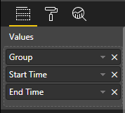
Drag the fields within R visuals.
Step 3
Open the code window and click on "Edit script in external editor".
Step 4
We have used the following two packages in the development of the Gantt Chart.
ggplot2
scales
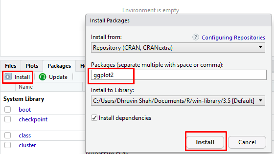
If R Studio doesn’t have those packages installed, install the packages.
Go to the Packages tab, click on "Install". Type the name of the package and click on the "Install" button.
Step 5
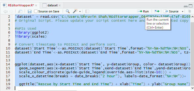
Paste the following code.
library(ggplot2)
library(scales)
# Convert timestamp to POSIXct and perform sort.
dataset$`Start Time`<-as.POSIXct(dataset$`Start Time`,format="%Y-%m-%dT%H:%M:%OS", tz ="GMT")
dataset$`End Time`<-as.POSIXct(dataset$`End Time`,format="%Y-%m-%dT%H:%M:%OS", tz="GMT")
ggplot(dataset,aes(x=dataset$`Start Time`, y=dataset$Group, color= dataset$Group)) +
geom_segment(aes(x=dataset$`Start Time`,xend=dataset$`End Time`,yend=dataset$Group),size=15) +
scale_colour_discrete(guide=guide_legend(override.aes=list(size=10))) +
scale_x_datetime(breaks = date_breaks("2 hour"), labels=date_format("%H:%M"))+
ggtitle("Rescue by Start Time and End Time") + xlab("Time") + ylab("Group Name") + theme_bw()
Step 6
Select all the code and click the "Run" button.
Step 7
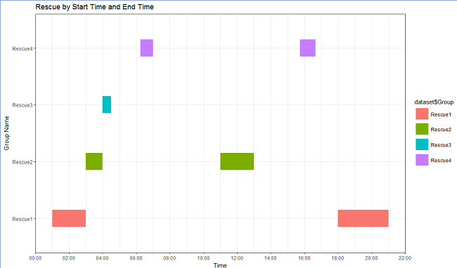
We can see the output in the tab of Plots. It is showing the following type of Gantt Chart.
Step 8
Copy the same code and place the code within the R Editor in Power BI and click on "Run" button.
Step 9
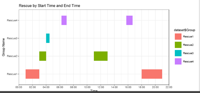
The R visual will look like following.
Step 10
Publish the report in your App Workspace. Make sure you have a Pro license activated, otherwise, you are not able to see the R script visualization.
Conclusion
This is how we can create a Gantt Chart within Power BI. Stay connected with me for these types of amazing articles in the future.









Comments