Every profession has their unique toolbox, full of items that are essential to their work. Painters have their brushes and canvas. Bakers have mixers, pans, and ovens. Trades workers have actual toolboxes. And those in a more corporate environment will have a suite of hardware and software necessary to complete the task at hand. Data scientists tend to fall into this last bucket.
I’m of the opinion that one of the most exciting tools in a data scientist’s toolbox are the visualization libraries available for use. Data viz is a great way for technical operators to bridge a gap and bring insights to a non-technical audience.
A brilliant library that was released in late 2016 is the SHAP library. The SHAP (SHapley Additive exPlanations) library was developed to unpack some of the “black box” aspects of machine learning models, and to better explain the output of models. In the developers’ own words:
“SHAP connects game theory with local explanations, uniting several previous methods and representing the only possible consistent and locally accurate additive feature attribution method based on expectations.”
**Quick note** The remainder of this post will provide a quick introduction to SHAP and I’ll show how I’ve used it to better understand a few models I’ve built. I am still learning a lot about this library, so please do additional research as you utilize these methods yourself. Any feedback is also appreciated!
Working with SHAP
The SHAP visualizations use what are known as SHAP Values to plot information. SHAP Values are the determined impact each feature will have on an output, derived from breaking down the prediction. Samuele Mazzanti does a great job explaining how SHAP values are calculated here.
The library is easily downloaded with a pip install.
!pip install shapSHAP is versatile and has “explainer” models for every type of ML model. A general explainer can be called with the shap.KernelExplainer, but it tends to perform more slowly than using the explainer that is specific to the type of model you have built. It is best to call the appropriate explainer when you are ready to begin plotting.
SHAP has explainers for tree models (e.g. XGBoost), a deep explainer (neural nets), and a linear explainer (regression).
After calling the explainer, calculate the shap values by calling the explainer.shap_values() method on the data.
import shap
#Load JS visualization code to notebook
shap.initjs()

explainer = shap.TreeExplainer(xgbclassifier)
shap_values = explainer.shap_values(xgbX_train)
Then we get to visualize it using one of the many plots available!
shap.summary_plot(shap_values, xgbX_train)Here are two examples of personal projects where I’ve used SHAP to better understand the underlying model outputs.
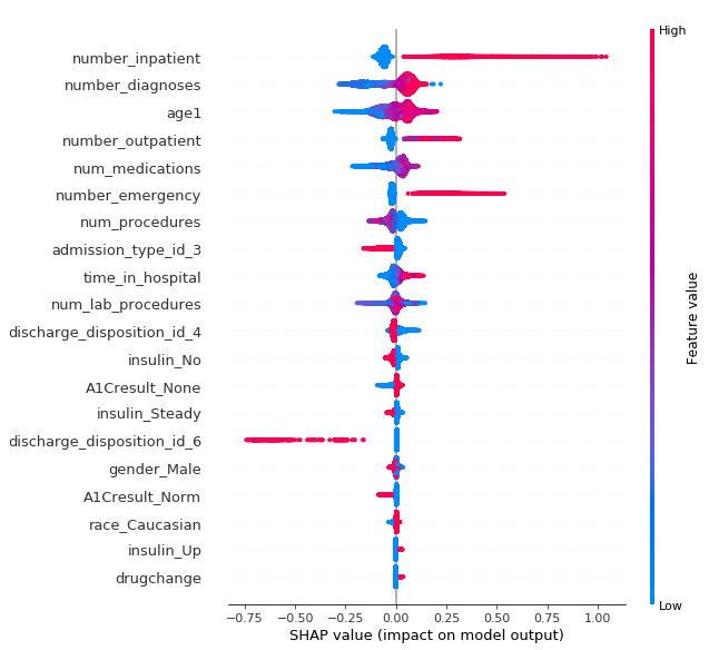
In this example, I was working with data about the hospital readmittance of patients who had some length of inpatient treatment for diabetes. You can find the full project on my Github here. In the summary plot, we are able to see a few things that will drive the model output up or down. A model output of 1 would signify that the patient would be readmitted for additional inpatient care while a 0 reflected no readmittance.
Determining patient readmittance
Each feature for each data object in the set is represented by a point on the graph. If feature values are high, they will show as red — if they are blue, they have lower values. The position of the point along the x-axis shows whether the feature value is pushing the predicted output towards 0 or 1. So we can see that if a patient had a high number of previous inpatient (number_inpatient) procedures or emergency room visits (number_emergency) preceding the current visit, they were more likely to be readmitted again. Lower age (age) drew the outcome closer to non-readmittance, as did having a lower number of medications (num_medications).
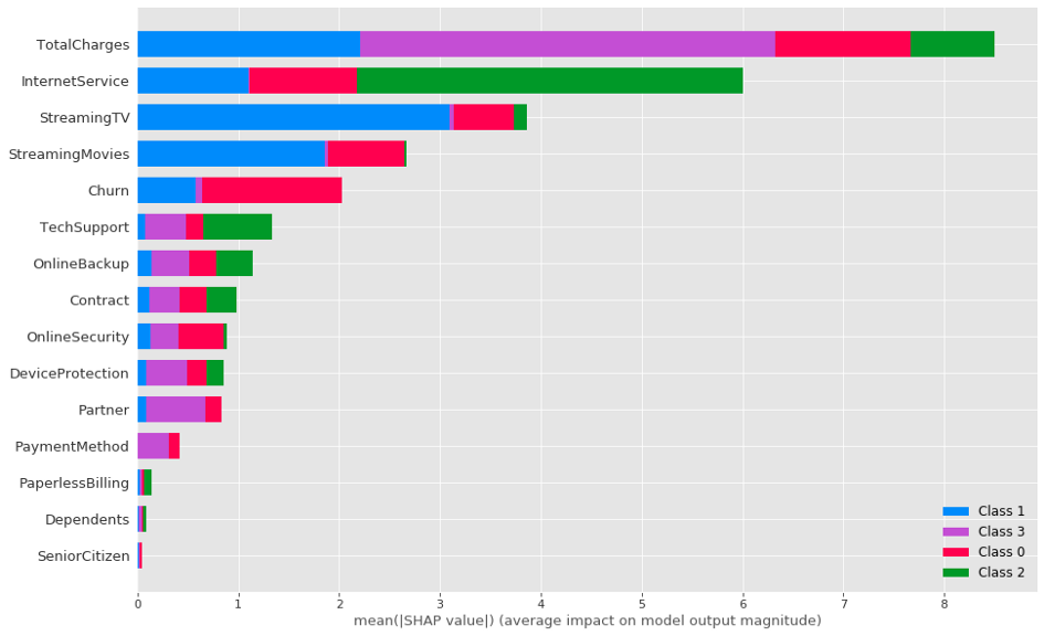
In this second example, we explore the features that are causing customers of a telecommunications company to fall into one of four clusters, the output of a K-prototype cluster analysis. You can find the full project here.
Inspecting customer clusters
I use a bar plot style for the summary plot here. The size of the bars shows the importance of the feature, so we can see that Total Charges and Internet Service had significant importance on the clustering. Streaming TV, streaming movies, and Churn have strong importance, and the 7 features following still have moderate explanatory importance.
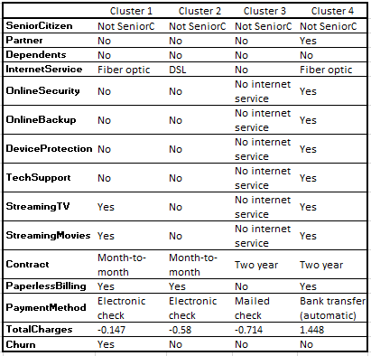
Cluster prototypes
Inspecting the prototype modes of the clusters (where Class 0 aligns with Cluster 1, Class 1 -> Cluster 2…), these make intuitive sense — Total Charges was very important for those in Cluster 4, and they tend to subscribe to all services. Internet Service was the most important feature for Cluster 3, and they had No Internet Service. Opting out of Streaming TV and Movies allowed Cluster 2 to stand apart from Clusters 1 & 4.
Hopefully the above provides a quick insight as to how SHAP can be applied to data science work. I think it’s a great tool and I’m looking forward to working with it more in the future.
Source: Medium
The Tech Platform


Commentaires